Top 10 bike brand logos (and the stories behind them)
Motorcycle brand names become part and parcel of everyday life for a biker, but do you know how the names, and badges, came about?

Motorcycle company names and logos are a big deal. People get ‘Harley-Davidson’ tattoos; historic British brands like Triumph and BSA are biker jacket fashion icons; Ducati T-shirts sell by the bucket-load…
But where did these names – and particularly the designs of their logos – come, from and why? Here’s the brief story behind 10 of the best and most recognisable.
Harley-Davidson ‘bar and shield’ – thanks Auntie!
Although the Harley-Davidson company was founded in 1903 by William S. Harley, Arthur Davidson, Walter Davidson and William A. Davidson, its famous ‘Bar & Shield’ logo didn’t make an appearance until 1910, although who created it remains something of a mystery. Some believe it was most likely created by the Davidson brothers’ aunt, Janet, who had assisted with pinstriping and in composing the Harley-Davidson name on early company literature and promotional material. A patent was issued for the logo in 1911, over the years it has taken on many variations and Harley has also used many other designs. But the Bar & Shield, in orange, black and white remains its most recognised.
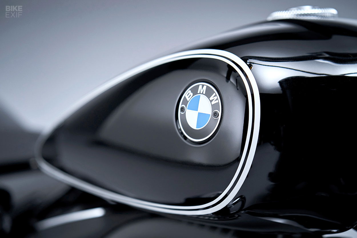
BMW ‘roundel’ – NOT a propellor
“Many people believe the BMW logo is a stylized propeller,” says Fred Jakobs of BMW Group Classic. “But the truth is a little different.”
The history of BMW – the Bayerische Motoren Werke or Bavarian Motor Works – dates back to 1917. BMW emerged from a renaming of aircraft engine manufacturer Rapp Motorenwerke, in Munich, Bavaria. When BMW was first registered in July 1917 there was no logo. However, on October 5 of that year its first ‘badge’ was registered retaining the round shape of the old Rapp logo but with the letters BMW and the inner circle displaying the state colors of Bavaria – white and blue.
The myth of the propeller came years later. A BMW ad from 1929 attempted to promote a new aircraft engine BMW was building under license from Pratt & Whitney and showed the BMW logo in an aircraft’s rotating propeller.
“For a long time, BMW made little effort to correct the myth that the BMW badge is a propeller,” explains Jakobs. Constant repetition has made this explanation a self-propagating urban myth. “This interpretation has been commonplace for 90 years,” Jakobs adds. “So, in the meantime it has acquired a certain justification.”
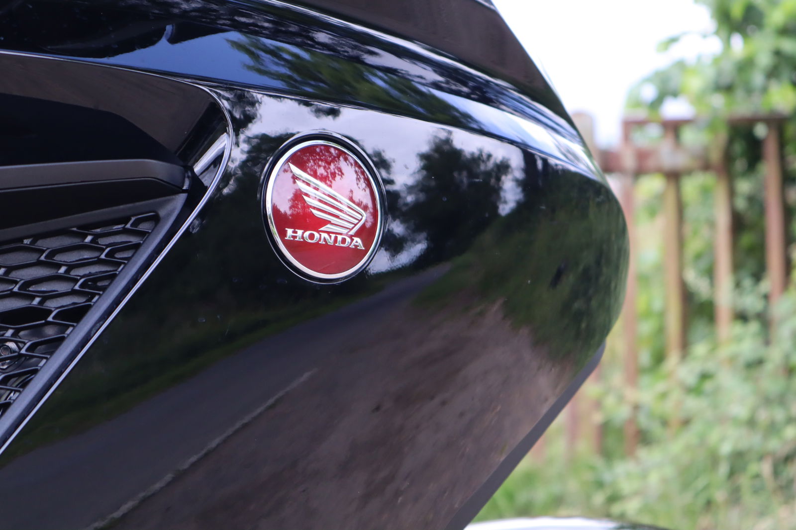
The Honda 'Wing' – on bikes only
Unlike other companies that produce both bikes and cars under the same logo (such as BMW, above), Honda does things a little differently, with different logos for each. Just before Soichiro Honda formed his eponymous company in 1947 the great man had already come up with the Honda Wing logo, as a symbol of his dream for future success inspired by the Greek goddess ‘Nike’ who personified victory and is usually depicted with wings.
Accordingly, on Honda’s first motorcycle, the 1947 A-type, the Honda tank logo included a Nike-style wing. This design then evolved over the years with the most recent update coming in 1988.
When Honda started also producing cars in 1961, however, it was decided to use a separate identity and a new logo, effectively a stylised ‘H’, was created. This, too, has been successively updated with latest version debuting in 2000.
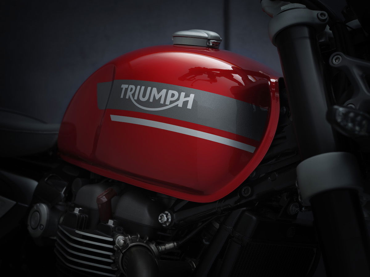
Triumph – no cars, please, we’re British
Triumph is Britain’s biggest and most successful motorcycle manufacturer with links, too, to historic British sports cars such as the TR6 – so it might come as something of a surprise that, first, it was founded by a German and, second, it can’t make cars under its own name as those rights are now owned by BMW!
Triumph motorcycles’ dates back to 1885 when German immigrants, Siegfried Bettmann and Maurits Schulte, started making bicycles in Coventry. Bettmann, thinking he needed a name better than his own, settled on Triumph and duly built his first powered Triumph motorcycle in 1902. Its first logo was, like Harley, a shield bearing the words Triumph and Coventry. Car production followed from 1928 then the motorcycle division was sold off in 1936, shortly after a new Triumph logo had been adopted which remained essentially unchanged up to the company’s collapse in 1983.
When John Bloor relaunched Triumph in 1991 a new, sharper version of the logo was created which was then softened in 2005. Finally, a new two-part logo was launched in 2013, one with a triangular icon reminiscent of the Union flag.
Triumph cars, meanwhile, was absorbed into British Leyland then Rover. Its last car was the Acclaim of 1981 which was essentially a rebadged Honda Ballade. BMW acquired the rights to Triumph cars when it acquired the Rover Group in 1994. It retained the Triumph rights along with others when it sold Rover to the Phoenix Consortium in 2000.
Yamaha – making sweet music
Although making motorcycles since 1955 and today one of the world’s largest motorcycle manufacturers, Yamaha’s origins are in musical instruments – hence its famous ‘tuning fork’ logo.
In 1898, one year after the establishment of Nippon Gakki Co., Ltd., forerunner of today's Yamaha Corporation, the company decided to use a tuning fork as its corporate mark. The three tuning forks of the Yamaha Logo represent the cooperative relationship that links the three pillars of our business -- technology, production, and sales. The design inside a circle was standardized in 1967, although there have been subtle updates since. The biggest difference between the logo of musical Yamaha Corporation is that its corporate colour is purple while that of its sister company, the Yamaha Motor Co., Ltd, is red.
.jpg?width=1600)
Ducati – from an initial spark…
Ducati was initially founded in Bologna in 1926 to make radio products by brothers Bruno, Adriano and Marcello Ducati then, post WW2, it started creating engines and vehicles, including motorcycles. This was such a success that in 1953 the two divisions, Ducati Meccanica SpA (the producer of motorcycles) and Ducati Elettronica, separated, leading to the creation of a new logo. Other logos were adopted in the 1950s and ‘60s, in 1975 a new logo by Giogetto Giugiaro was created which was used up to Cagiva’s takeover in 1985. In 1998, following Texas Pacifica Group’s takeover, another new logo came then, finally, in 2008, the current logo, by Landor Design, was adopted.
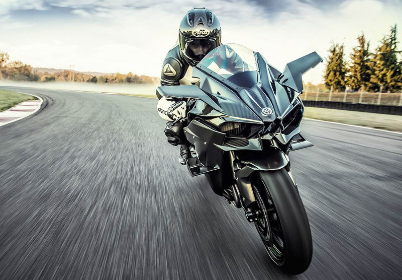
Kawasaki – from River Mark to Special K and back…
Like compatriot Yamaha, Kawasaki may be one of the world’s largest motorcycle manufacturers but its origins (and most of its business) remains elsewhere. So, while the Kawasaki company was established in 1896, named after founder, Shozo Kawasaki, and built up an empire in heavy industry including shipping, trains and aviation, its first motorcycle didn’t arrive until 1962.
The first Kawasaki logo came in 1961 and included a flag depicting a Japanese symbol, the ‘River Mark’, which celebrated the brand’s shipping heritage and legacy.
But its more familiar logo was created in 1967 comprising a large ‘K’ in scarlet red, chosen for its associations with Japan.
The historic River Mark re-appeared on Kawasaki’s supercharged Ninja H2 and H2R from 2015. Then, in 2021, Kawasaki declared that it would adopt the River Mark as its Corporate Identity symbol.
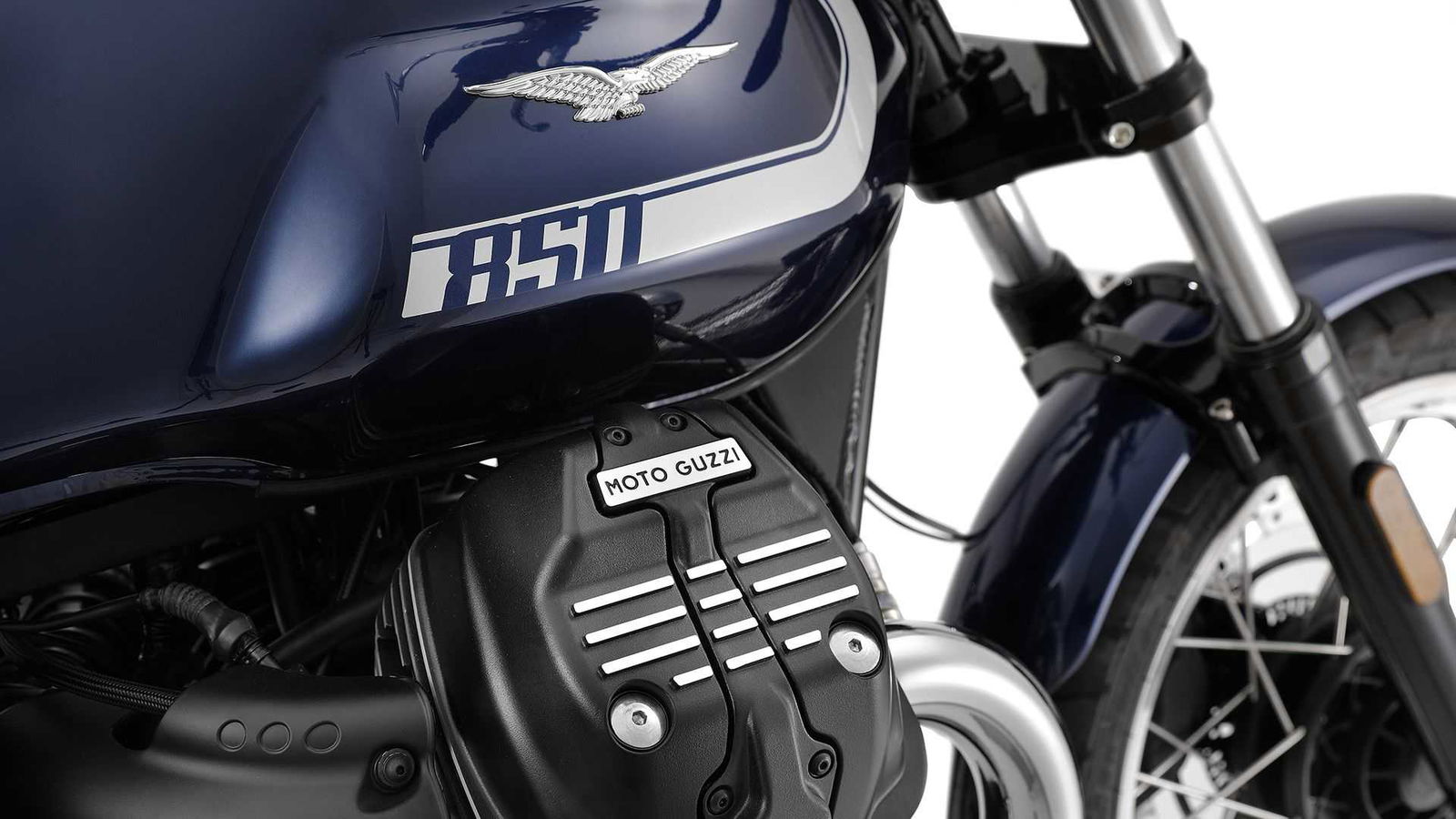
Moto Guzzi – for a friend
Italy’s oldest motorcycle manufacturer, Moto Guzzi, was founded when three friends from the Italian Air Corps decided to create a motorcycle company after World War I. The three were pilots Giorgio Parodi and Giovanni Ravelli plus mechanic Carlo Guzzi. Parodi, who was from a family of wealthy ship-owners, would bring the money; Guzzi would design the bikes, while Ravelli, already well known as motorcycle racer, would promote the bikes.
Tragically, Ravelli died in an aircraft crash soon after the war, but Guzzi and Parodi persevered and commemorated their friend in the form of the eagle in the company logo which was virtually identical to the ‘wings’ on their military uniform.
The Guzzi eagle logo has been updated repeatedly over the years, most recently in 2007.
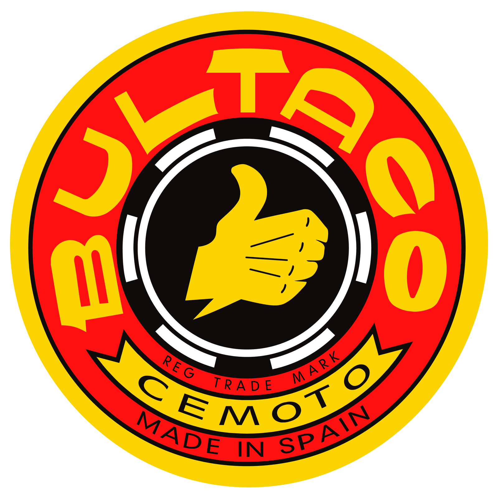
Bultaco – thumbs up
Although currently defunct, Spanish firm Bultaco has one of the most successful histories in motorcycle racing and its logo (and name) is one of the most storied.
Bultaco was founded in 1958 by Francesc Xavier Bulto Marques, commonly known to his friends as ‘Paco’ Bulto. Bulto had been a director at Montesa motorcycles in Spain which had been founded in 1944. However, in 1957, following an economic downturn, Bulto left when he fell out with co-director Pere Permanayer when the latter decided to close the racing department Bulto oversaw.
Persuaded by racing department workers, a new company was set up within days, named in his honour – Bult-aco – and offered its first bike within months. Bultaco went on to great success in road racing in the 1960s and trials in the 1970s, the latter via its revolutionary, lightweight Sherpa trials bike developed by Brit Sammy Miller.
The famous Bultaco ‘thumbs up’ logo, meanwhile, came about when Bulto witnessed British motorcycle racer David Whitworth giving the signal to his pit crew to signify that all was well.
Husqvarna – since 1689
Historic Swedish motorcycle brand Husqvarna’s ownership may be more complex and convoluted than many, but its famous logo is comparatively simple.
Originally founded in 1689 Husqvarna is one of the world’s oldest companies. It initially produced muskets with the logo it adopted being a rounded seal with three lines coming up out of it, resembling a crown.
Husqvarna began producing motorcycles in 1903, its motorcycling arm was separated in the 1980s and has been repeatedly sold on since, first to Cagiva, then BMW and now to KTM.
The logo we’re familiar with today was first introduced in 1974 and designed by Hornaz Kapadia as an evolution of the original. In 2012 the blue was switched to a darker shade.
