Pretty F(Ugly) Part Deux | Ugly motorcycles only a manufacturer could love
Beauty, style and fashion are subjective... but then some subjects are more objective than others. Here's Part.2 of Visordown's Ugly Motorcycles celebration

There are motorcycles that make you go hmmmm. There are motorcycles that make you go PHWOAR. There are motorcycles that have you reaching for the eye bleach.
Today we are honouring the latter with the second part of our ‘Ugly Motorcycles’ feature.
Of course, beauty is subjective and far be it from us to tell you what to think but since our Mastermind subject is motorcycles……
Anyway, there is - logically - also a Part.1 which you view HERE but once you have done that, here is Part 2 for you to enjoy recoiling in.
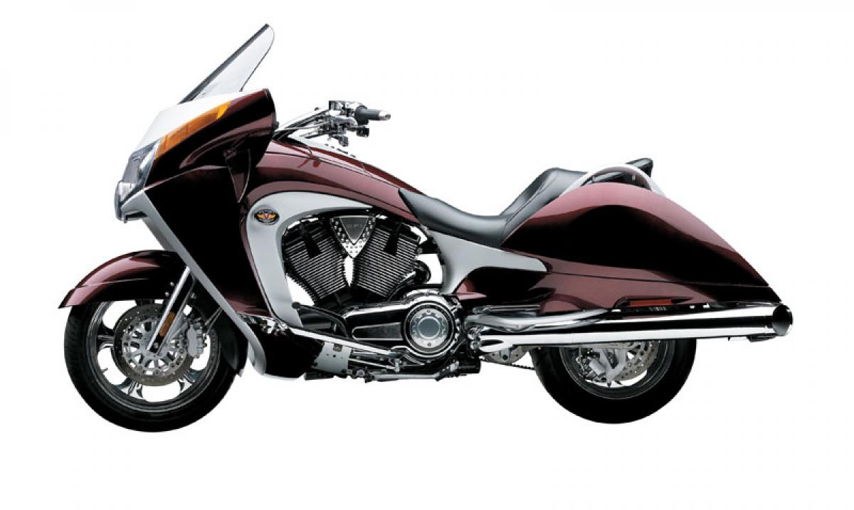
Victory Vision
Now we’ll agree refinement, comfort and practicality tends to demand a few aesthetic compromises on a big cruiser motorcycle, just because it is a challenge doesn’t mean you should fail it.
Take the Victory Vision for example. On the one hand the big hulking American cruiser looks like the most elaborately comfortable armchair in the world, though we wonder if there is a danger of falling asleep at the controls.
Either way, even Frasier Crane will agree it is uglier than the threadbare perch he regularly mocks belonging to his father.
We love a butt-hugging, squishy seat for covering long miles, but the Vision echews all of its form for function with a profile of swoops and curves that nestle awkwardly between foul custom job and 1950s pastiche.
Ungainly, unwieldy and unattractive, while we wouldn’t want to suggest the launch of the Vision was responsible for the company’s eventual demise, let’s just say not much time elapsed between the two events.
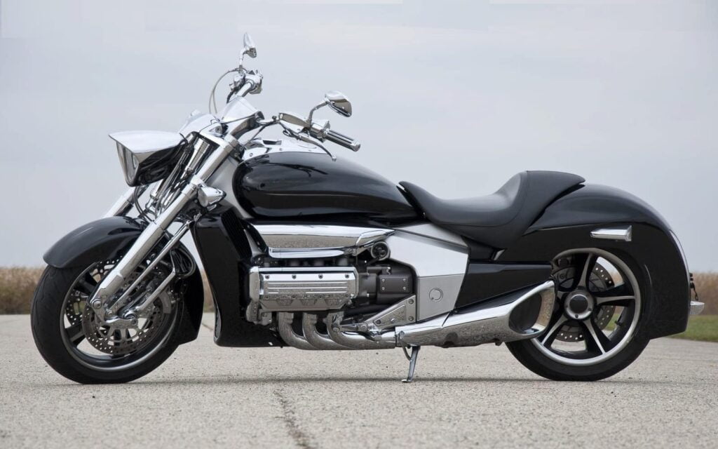
Honda Rune
If this motorcycle was wheeled out as the product of the custom scene demonstrating the subtle-yet-evident Japanese take on ‘bad-ass’ cruisers typified by the Harley-Davidsons of yore, then it’s lashings of chrome, tapered lines and aggressive feet forward, seat back, arms up riding position have a quirky one-off appeal.
However, when you're a Honda Valkyrie Rune sitting alongside a Honda Monkey or CB1000RR in the showroom, you're the person in fancy dress at the office after getting their dates wrong. And your boss won't let you go home to change.
Indeed, getting a look so excessive to work it needs to be drenched in a whole load of knowing razzmatazz… like going to Five Guys because you know it is terribly tasty.
But like McDonalds offering a £50 Kobe Beef Burger alongside a £3 Big Mac, Honda and glam don’t really mix so in the end the Rune just looked embarrassingly vulgar.
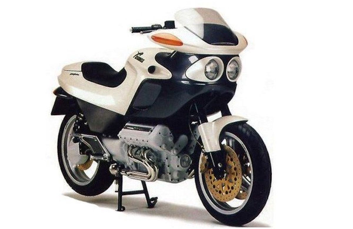
Morbidelli V8
Ahh, the Morbidelli V8... let's just say there is a lot going on here.
Grand Prix racer-turned-eponymous motorcycle builder Giancarlo Morbidelli envisaged his simply-titled V8 to be a big, beefy torque-box that put the 'Sport' in sports tourer.
Revealed in 1994 the V8 was a googly-eyed muddle of ideas endowed with some unfortunate proportions, flimsy-looking bodywork and with an engine so large it ends appearing to be bolted onto the bottom as an afterthought.
It gets worse. It had walnut-effect dash trim like a Rover 800 - something no-one has ever requested to have on a motorcycle, at least not since 1992 - and an unreadable digital speedometer, while the behemoth of a 848cc engine produced... 100bhp.
It gets worse still. It was priced at £90,000 which in the mid-90s is about the equivalent of £170,000, possibly more, today.
Morbidelli couldn't understand why it wasn't a success but we don't know where to start!?
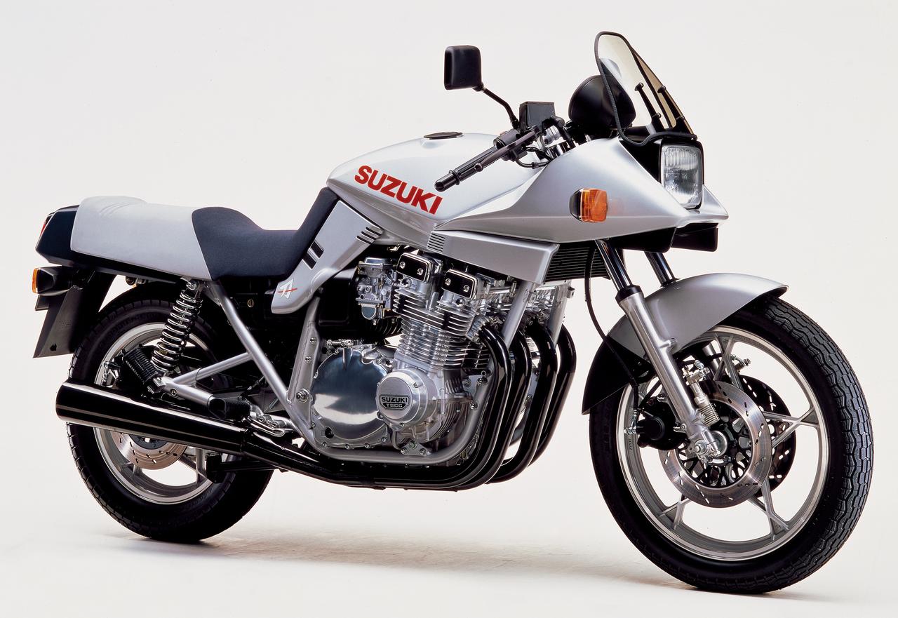
Suzuki Katana
There is often a fine line between cutting-edge style and gawky design, but the Suzuki Katana is perhaps something of a unique case here.
Allow me to explain. The original Katana is fondly-regarded as an unusual, yet sharp step forward in sportsbike design for its era typified by its top-fairing stretching into a big blocky squared-off front-end and exposed mechanicals.
It was a divisive looker back then but it was a success and time has mellowed those views to be in favour.
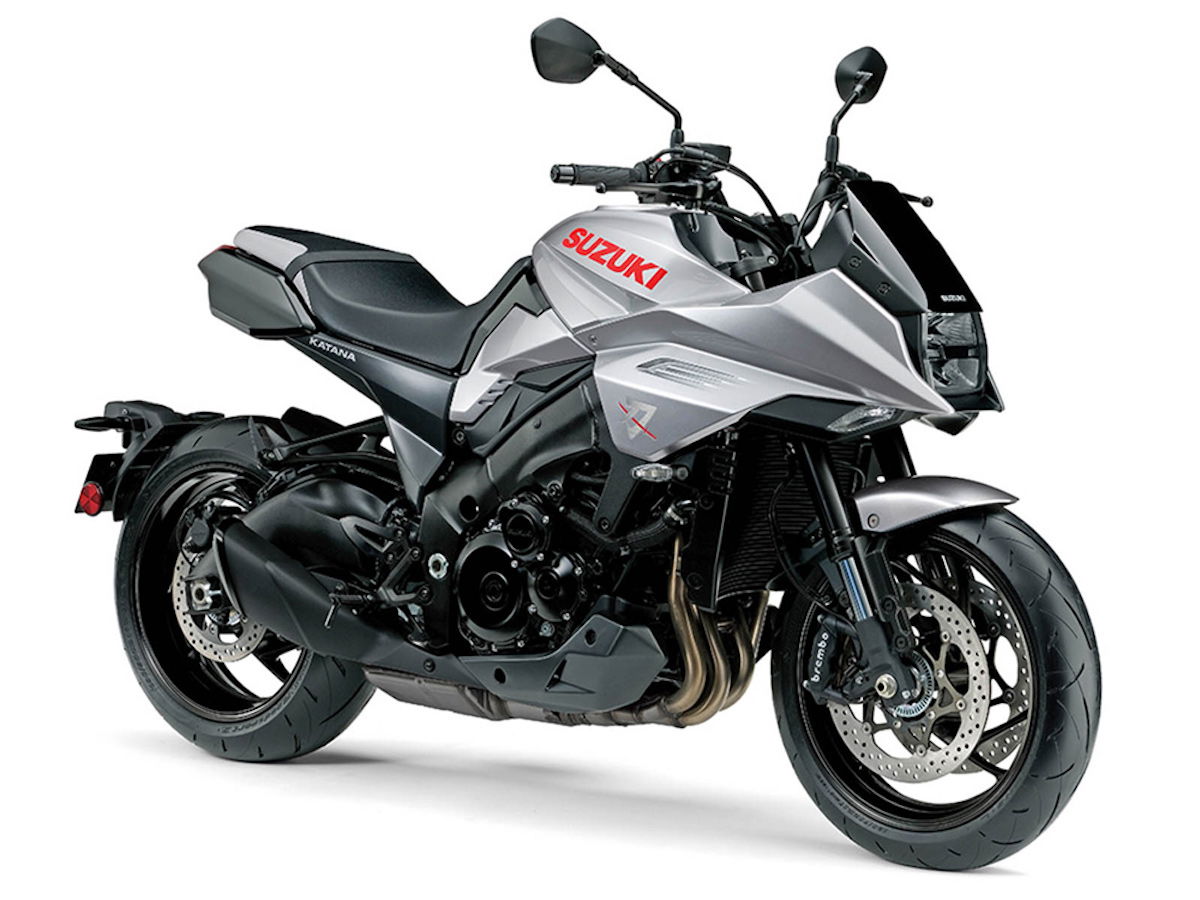
Then Suzuki launched the modern-day Katana which, while certainly a faithful take on its spiritual predecessor, is… well, it’s bland.
Bland doesn’t make ugly but it does make us look at the older Katana in a new light as though Adele released a terrible dubstep album that makes us listen to her ballads in an entirely different way.
Ducati Multistrada Mk.1
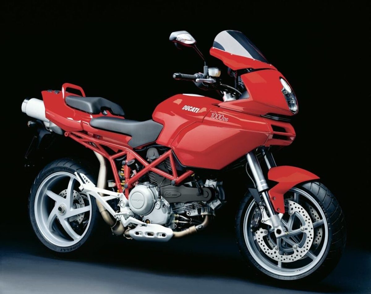
Some motorcycles mature with age and the Ducati Multistrada is without a doubt the ‘silver fox’ of formerly awkward teenagers.
Ducati has plenty of options to put forward when talking about beautiful, heritage-laced motorcycles, but press them harder and a few missteps will trigger some less favourable reactions.
Take the Multistrada Mk1. Already a controversial change of direction for Ducati, the 'Many Roads' lurched into the sensible but hardly sexy sports tourer arena in 2003 bidding to inject a healthy dose of brio into the sector.
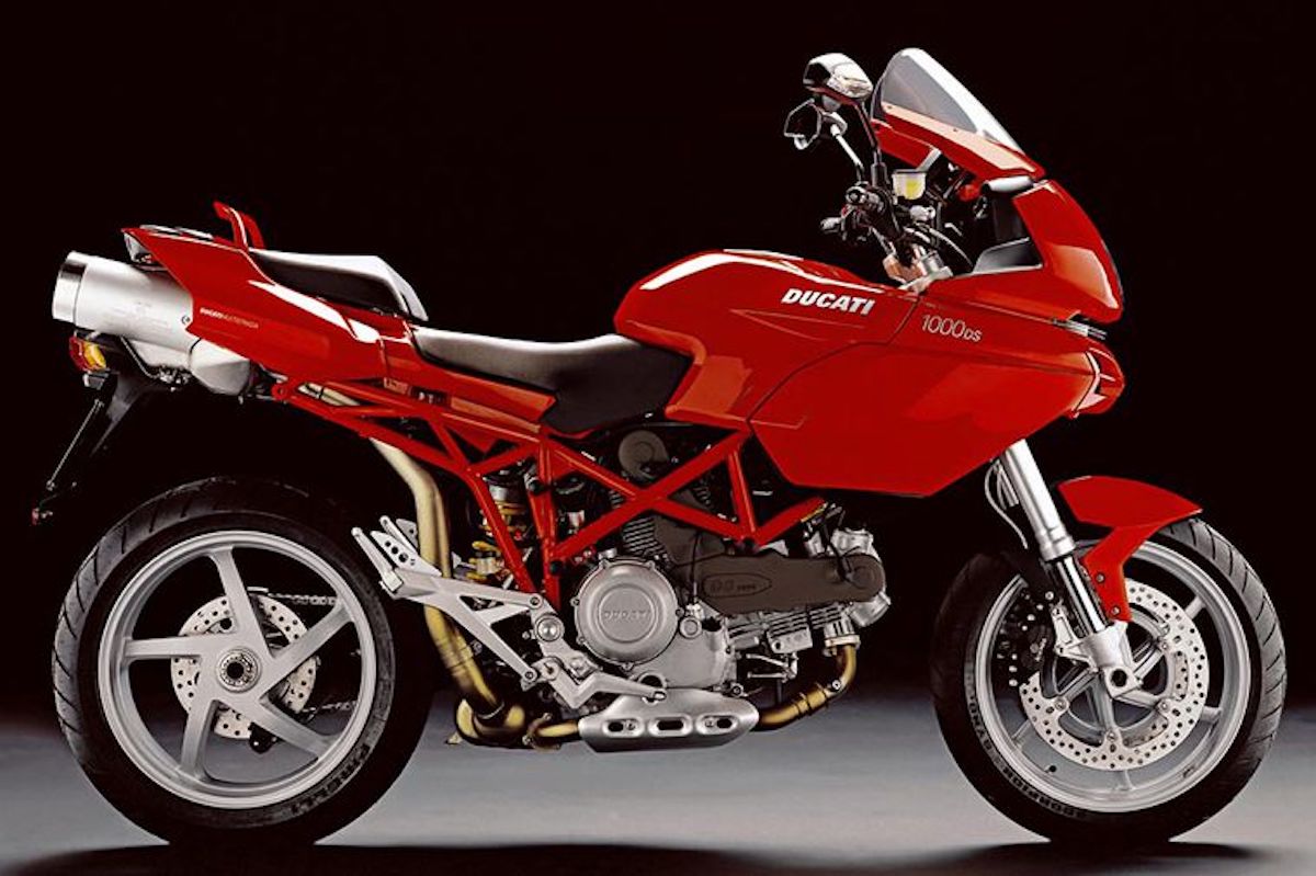
Instead it created a bizarre looking machine that appeared to have been penned by two entirely different sets of designers with two entirely different briefs before being stitched together at the end.
On the bottom half you see a signature exposed frame, polished exhaust and sporty five-spoke rear wheel. So far so good. Then your gaze rises towards a bulbous upper that half bulges out like someone put a top box luggage compartment on the wrong end.
Some angles are prettier than others, but unless you’re going to use exactly the same path when approaching it, you’d struggle to conjure the one thing that makes Ducati so popular - a love for your machine every time you clasp eyes on it.
Buell RR1200 BattleTwin
With a name like ‘BattleTwin’ how could you possibly go wrong? Well, Buell found a way.
A big, beefy sportsbike way before the Hayabusa was the Hayabusa, the Buell RR1200 BattleTwin was quite a sensation with myriad clever touches all over, such as horizontally mounted rear suspension and a bespoke frame.
This comes as little surprise since it was the first model to have conceived by renowned engineer Erik Buell himself.
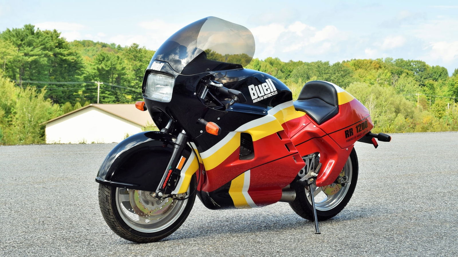
Alas, while the RR1200 BattleTwin was a marvel under the skin, that actual ‘skin’ was hideous.
It serves a purpose as an effectively streamlined and aerodynamic complement to its hefty power and torque, but it made the RR1200 BattleTwin look overweight and overstyled with its osentatious curved screen, front-wheel arch and drag-aping broad fairing.
Looking like something you’d take to Bonneville Salt Flats, while the bloated RR1200 BattleTwin might look cool at full throttle against a mountainous backdrop, out in the real world it just looked like it ordered everything in super-size.
Lamborghini Project 90
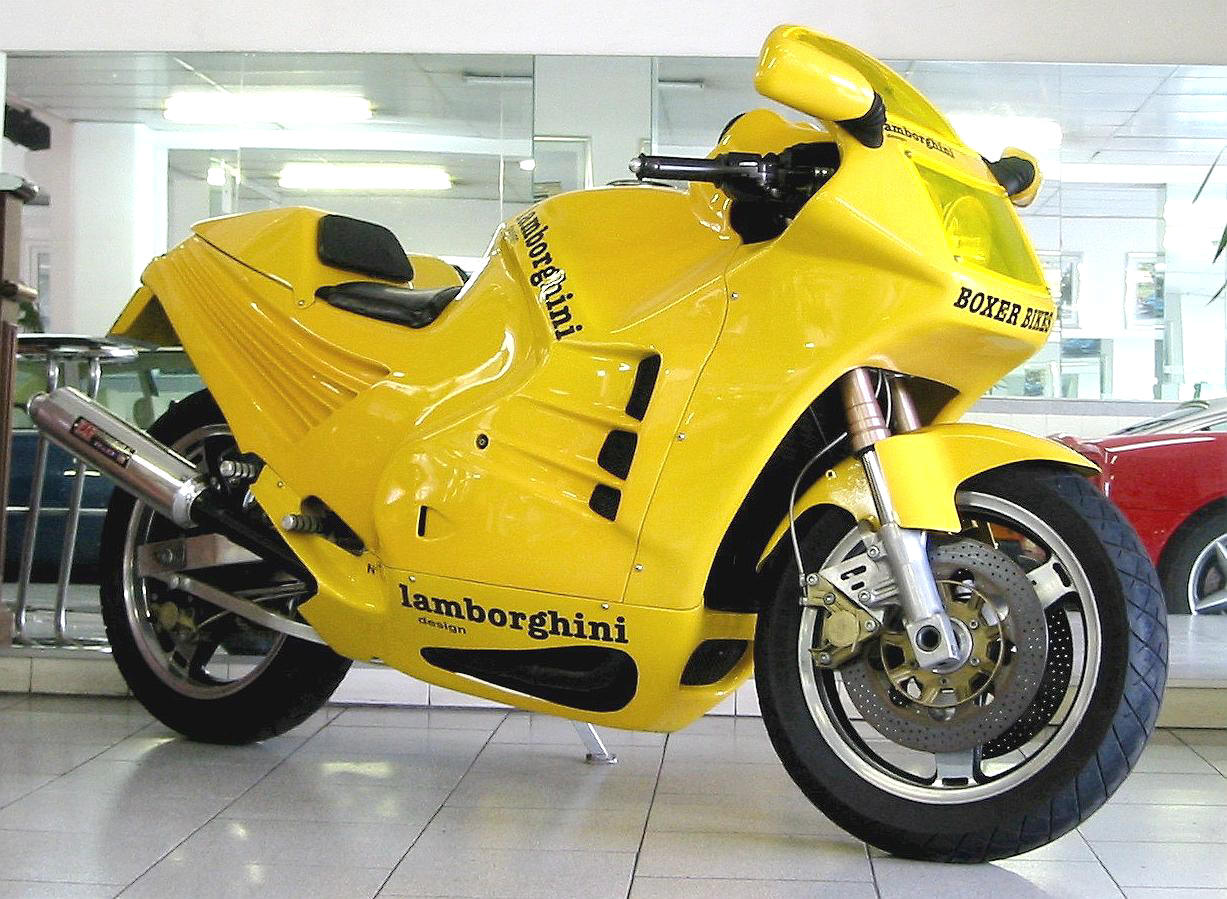
We can't be sure anyone ever thought 'hmmm, I wonder what a Lamborghini Countach on two wheels would look like', but if it did cross your mind then BEHOLD, it does actually exist.
Perhaps THE iconic supercar of the 1980s excessive yuppie era, the Countach doesn't strike as the most obvious inspiration for a motorcycle but Lamborghini's new owners were feeling ambitious, enlisting French company Boxer to handle the development.
The result was the Lamborghini Project 90. For a Lamborghini it was actually pretty bulbous and probably featured the first curve the company had featured on a model for a decade.
However, on a motorcycle it appeared cheap with its shrink-wrapped front fairing, go-faster slashes and gills that look warped from certain angles. Oh, and of course it came in retina-peeling colours.
Weighing only 184kg and packing 130bhp, the Project 90 had some squirt but Lamborghini's boom was about to bust and the sportsbike plan was shelved after only six were produced.
If you happen to be one of those six owners, you should probably know that it is worth a fortune now with a value of around £80,000.
Apparently questionable taste is invaluable…
Aprilia Moto 6.5
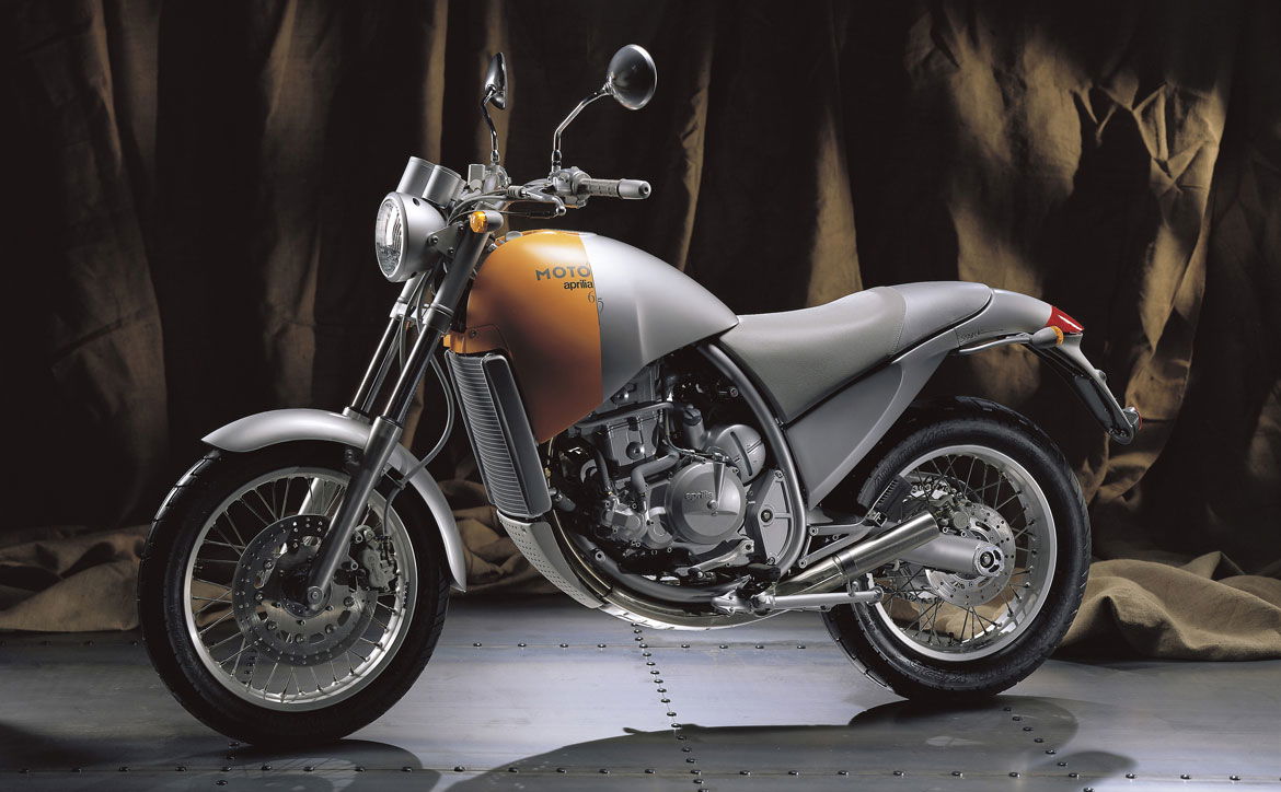
It isn't often Aprilia gets it wrong with its motorcycles. And if you have an eye for design, there isn't much Philippe Starck gets wrong either... after all, who thought a lemon squeezer could be sexy?!
It's quite a jump to go from crafting furniture, kitchenware and, erm, loos to motorcycles so perhaps it's not surprising to find that when Aprilia gave Philippe Starck lemons he designed... a lemon.
The Aprilia Moto 6.5 is certainly an engaging looker and one can see the vision if you squint and use some imagination, but the proportions are ungainly and the bulbous fairing makes it look unfinished.
It's avant-garde and chic, two words not necessarily high on the list of wants from bikers, and who are we to judge what's hot on the runways of Paris... but this is Manchester, it's damp and it's on pot-hole ridden road, so it’s just weird.

.jpg?aspect_ratio=1:1)


